A Search for Better Results
A guide book for how to compete against Google. DuckDuckgo could fairly quickly step up their game (which is already impressive) with some improvements to the results.
In case you want to play along:
https://duckduckgo.com/?q=golf+courses+phoenix
https://www.google.com/search?hl=en&q=golf courses phoenix
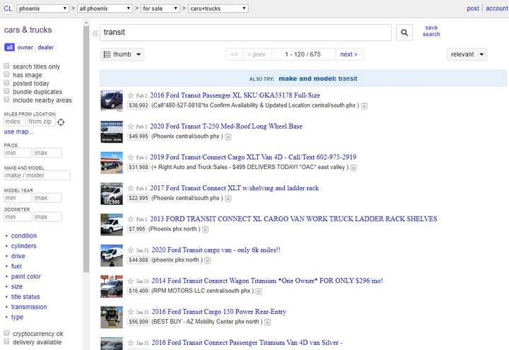
https://phoenix.craigslist.org/search/cta?query=transit
The Beauty of Craigslist
Craigslist is commonly considered an "ugly" site by designers. According to Wikipedia:
"The site serves more than 20 billion page views per month, putting it in 72nd place overall among websites worldwide and 11th place overall among websites in the United States (per Alexa.com on June 28, 2016), with more than 49.4 million unique monthly visitors in the United States alone".
Craigslist only employees about 50 people, amazing. The site is very functional. Maybe it isn't pretty, but I will take functional over beautiful any day.
DuckDuckGo, forget about competing on search, focus on results. If a results page had the same functionality as Craiglist it would be amazing. It wouldn't be too hard to improve upon the functionality.
I know, it is easy to say something isn't hard when you aren't the one doing the work. I am not talking about huge backend functionality. This has nothing to do with crawling, storage or databases, servers, etc. 90% of what I am talking about is how the results are displayed. To put it semi-technical, 90% is css and a little client side js.
Starting Point
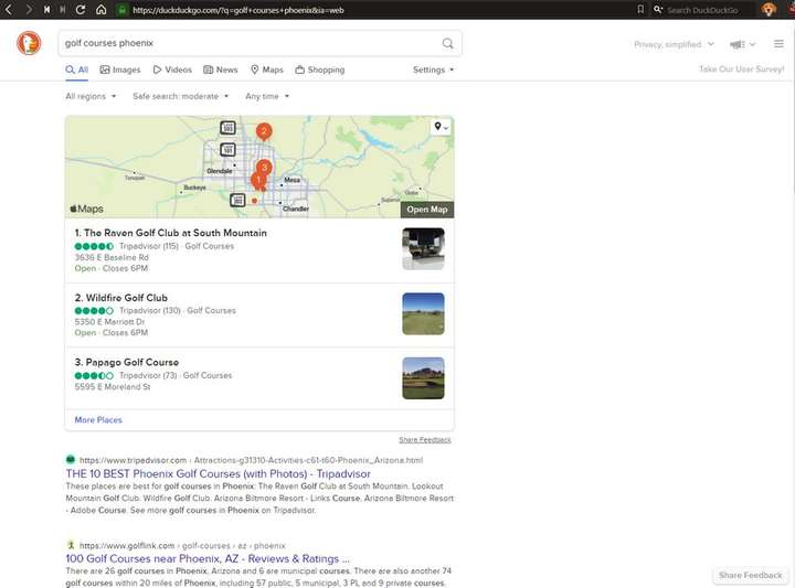
I want actual sites, not aggregators. The search engine is my aggregator. I don't want recursive aggregation, I want the results, that is why I am searching. 7/10 DDG results are not for courses but for lists of courses. If I wanted a map, I would choose the map option. If I wanted to search Trip Advisor, I would have gone to Trip Advisor.
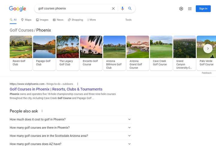
Google does pretty good here, at least in initial display. At the top they (appear) to have links to actual courses with the names and image in a nice card format. Nice job Google. But sadly, clicking on any of them simply changes the search terms and keeps you on Google. <sarcasm>Nice job Google.</sarcasm>
Craigslist Features

Wow, lots of features and power!
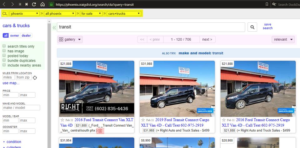
The top (yellow) section is broken down by location > for sale > cars and trucks. This could be useful in search too. Imagine a search for "vegan breakfast". Search could be smart enough to fill these drop-downs with common search parameters. The first drop-down could be: "All, Recipes, Restaurants...". If Recipes was chosen the next drop downs could be filled as well. In the end your drop-downs might look like: Recipes > Breakfast > Vegan. This may be a difficult feature to fully implement but even if it was display only, as a way of showing what the search engine thinks you want. This would allow the user to revise their query to get the results they are looking for.
The checkboxes on the left (green) are really great. Search titles only- I use this all the time. I hate it when I search for "durango" and get a bunch of non-durango results because posters added every keyword in the universe to the end of their post. Search titles only allows you to filter out noise.
Bundle duplicates could be used in many ways. It could be used as a way of grouping result by domain. It could also remove duplicates at the top-level, e.g. xyx.com/a, xyz.com/b, xyz.com/c would be condensed to xyz.com. Each domain would only get listed once.
The double left arrows let you hide the filters and focus on the results.
The purple highlighted area lets you deal with the post-search-and-fitler results. Meaning it doesn't change what results get returned, it only changes how the results are displayed.
Results can be shown in a list display, a grid display or a map display. The number of results returned is right there, front and center. This is vastly better than scrolling to the bottom and seeing a "more" link. You can also sort the results.
Finally, the the little garbage can X (red) lets you hide an individual result. Oh how I wish it was easy to do this in a search engine. An option to hide a specific result or the entire domain. No, I don't want anything from Pinterest or HufPost- ever.
So much of this is design 101. A modern motif is "don't make users think". This might be a good idea but has been interpurted all wrong. People don't want to over-think complicated processes, they do want to make simple decisions to get what they want. Non-technical users don't have to think about Craigslist to understand it and use it.
Craigslist used boring, ugly, dated (aka familiar) controls. Checkboxes aren't sexy but checkboxes have been part of GUIs since the early days. Checkboxes are a skeuomorphic design element- they are a digital representation of an element from the physical world. Some ancient Bablyonian probably invented the checkbox.

Craigslist has like functionality grouped together. The yellow section is the top level categories. The green lets you filter and refine results by data points and parameters. The purple area is right above the results because it changes how results are displayed. The red button is placed on a single result because it impacts that single result.
All DuckDuckGo offers is Region, Safe Search and Time. If I search for "Golf Courses Phoenix" with Region = Bulgaria and Time = Past Week I would expect zero results. In reality I get similar results but in a different order.
Freemium Model
Google is an advertising company, no, they are more like Papparazzi. They make their money by secretly following you around, tracking every aspect of your life that they can (which is a lot) compiling your private information and selling access to this information to advertisers. Nobody wants this, billions of people tolerate it.
Hacker News is filled with "I would pay for a good search engine" comments. I think a really good search engine could be free, with a great and powerful version a paid extra. To DuckDuckGo, I propose a paid DuckDuckGod version, it is DDG in "God-mode".
Stupid Simple Sample built in Notion
Here are search results stored in Notion. You can change the view, filter and search within the results.
Gravy
What else can we add- oh sooo much!
Search will often return 9,785,344,233 results. I don't care. Why tell me that if there is nothing I can do with it? Why not let me range and limit on these? Free version gives you a limit of 100, premium, 1000.
Inception style search. Search within the results, without loosing the results. The data-points returned from a search engine are: name, link, description and image (bonus). 4 data points is small potatoes- lots of room for gravy. Pass me 4 data points for the first 1000 results, let me search within these without losing the 1000 results.
Search by site size. Show me how big the site is. If the link is pointing to a 35MB bloated behemoth, let me know before I click on the link.
Search by site features and BS. Show me if the site has Google Analytics installed, tell me if it is an Amazon Affiliate Site. Is there an auto-play video, I want to avoid those. Paywall- lets not waste anybody's time.
Golfnow.com is a 10MB shit show. The search engine doesn't have to be opinionated, just let me know what to expect and I will decided. Possibly partner with Builtwith.com or Ublock Origin.

Let me know before I click that I will be hit with tracking, notifications and popups. If sites try to hide the fact that they do pop-ups, alert me that they use dark-patterns and deceptive practices.

Thanks Craig Newmark

While we are here. Lets talk about Craig, of Craigslist. Not only did he provide us with a great service (who hasn't used it?), it is a great design! A design that has needed very little tweaking.
Pardon my French but fuck Bezos, Gates, Musk and the other tech leaders.
Craig could have monitized the hell out of Craigslist. He could have bought and shut down competitors, creating a monooply. He could have been tracking users and selling their data. Craigslist could be covered in ads. The business world would have praised him for his ruthless business smarts.
He could have hired 1,000 Silicon Valley tech peeps to A/B test the site into hell. He could have UX designers tweaking the logo every year and arguing over fonts. The artists of the world could have said he was a perfectionist visionary like Steve Jobs.
He has managed to run a top 100 site with 50 employees but you never hear about how smart he is.
He could pay his PR people to tell the world he is a Philanthropist, or make hollow promises. Instead he quietly gives money to charities he believes in.
As tech billionaires build and amass dozens of mansions, fly in private jets, own mega-yachts and yet claim to be environmentalists, according to Wikipedia: He splits his time between a house in San Francisco's Cole Valley and an apartment in New York City's Greenwich Village. He flies commercial, does not own a car, and prefers using public transport.
Him and his wife enjoy birding together. It isn't flashy. There are no Lolita Express trips to Epstein Island here. He isn't out Tweeting like like a spoiled teenager. He isn't building penis rockets.
Thanks for being a decent and normal guy Craig.


